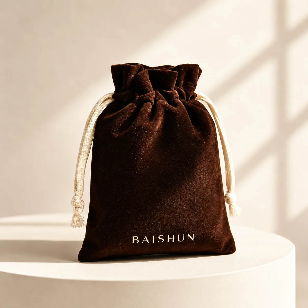
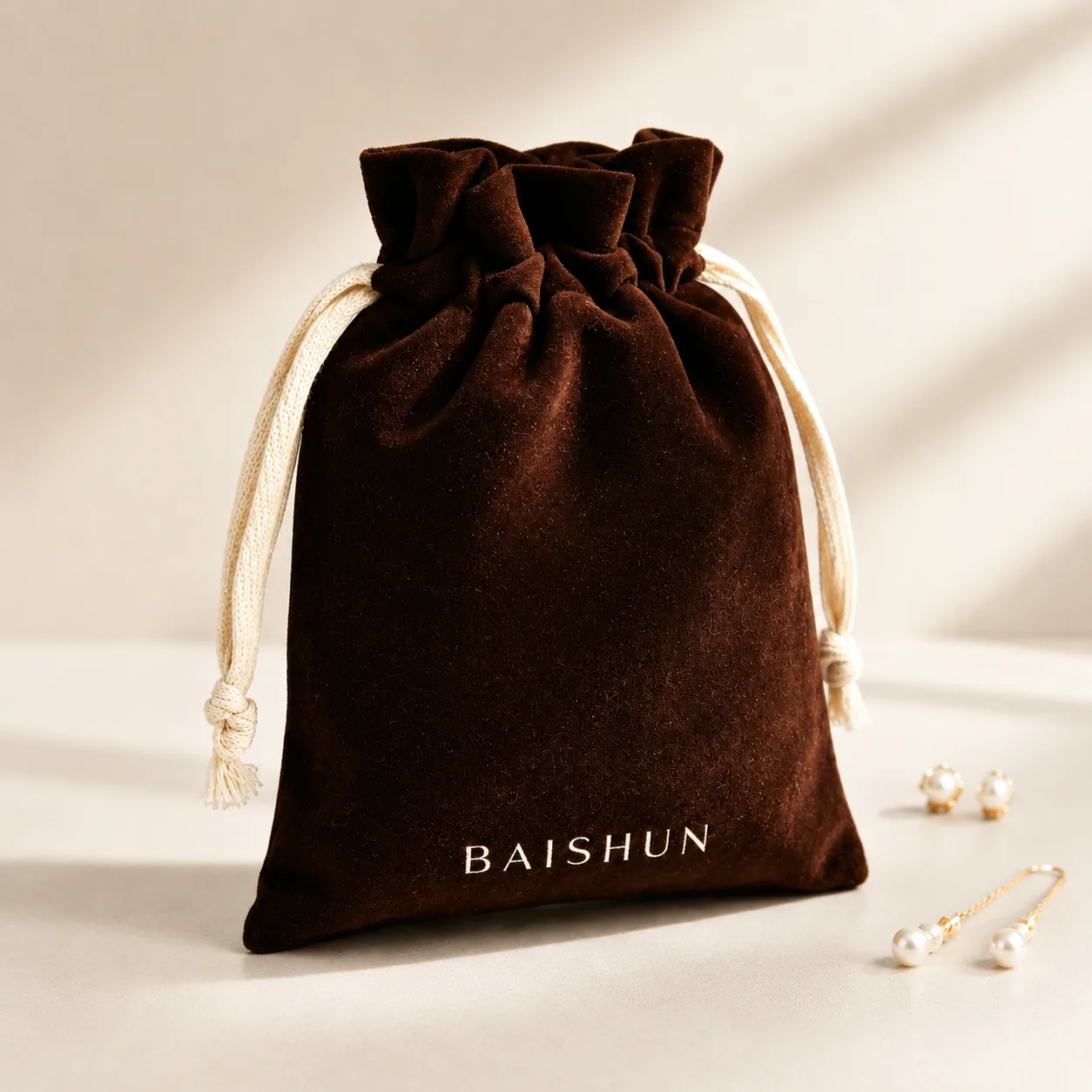
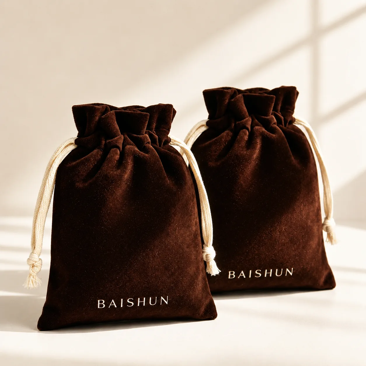
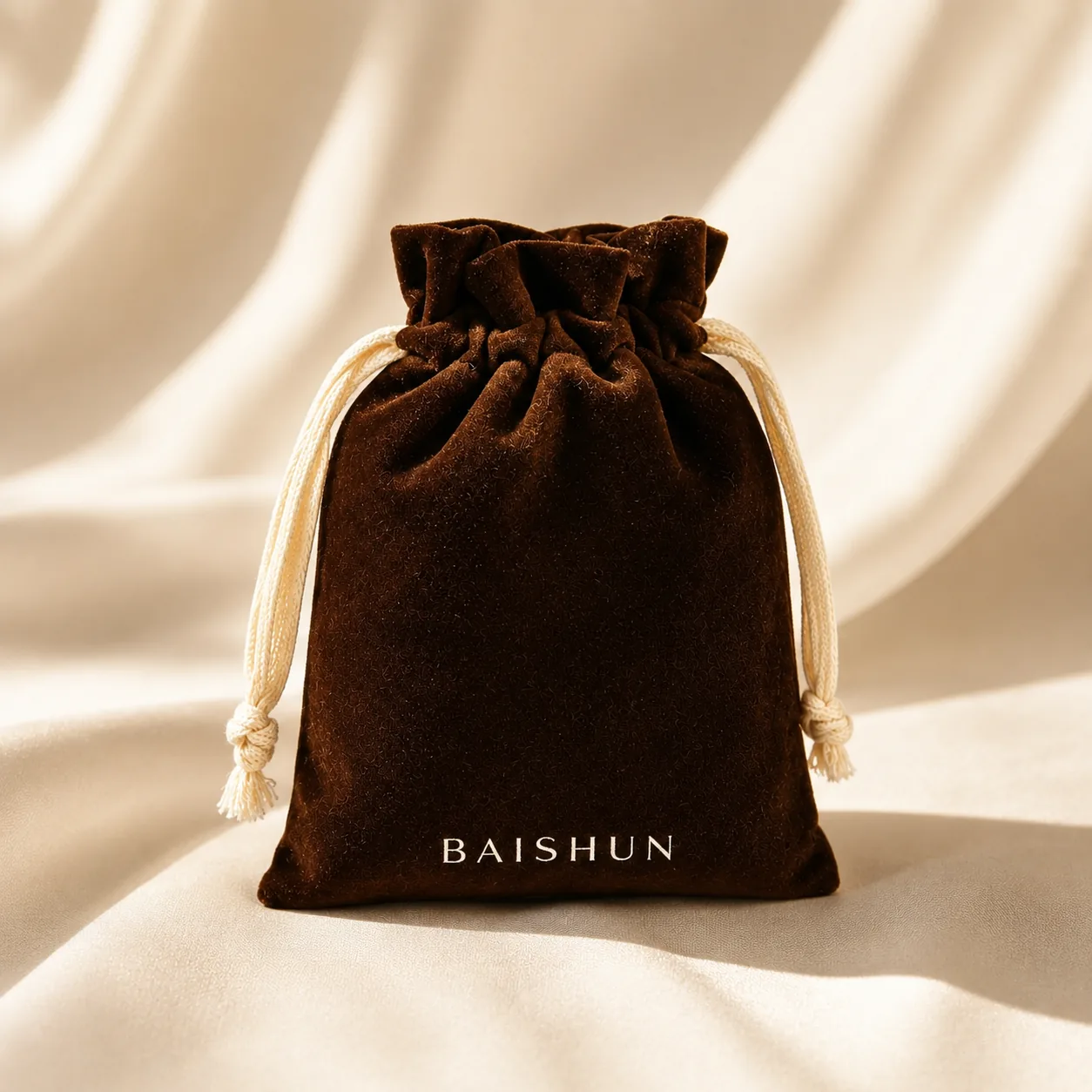
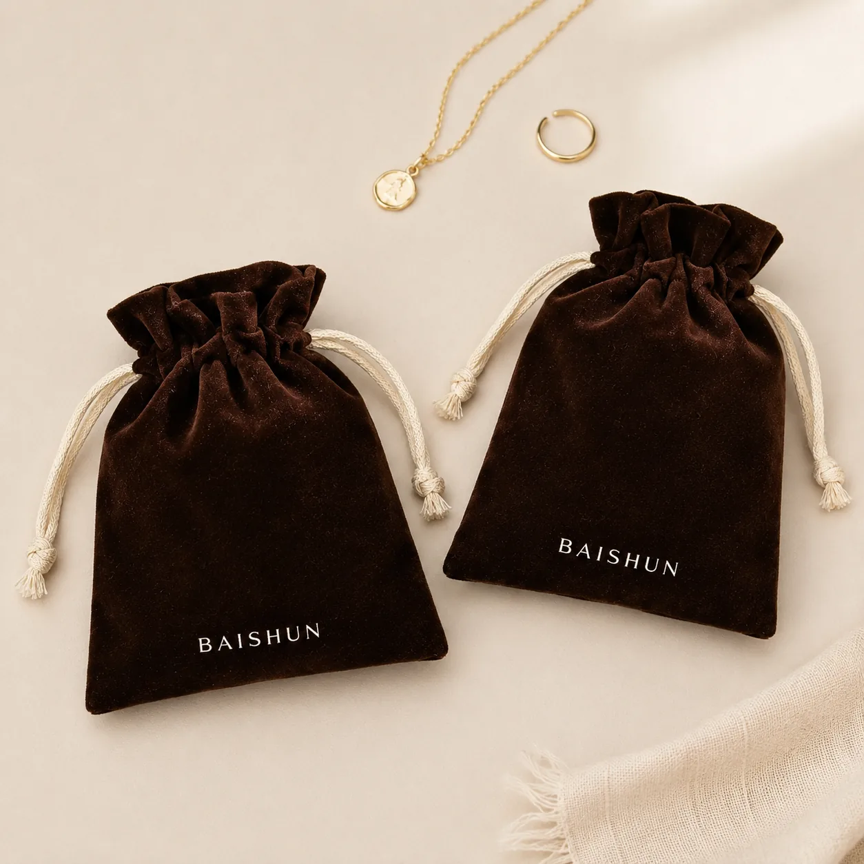
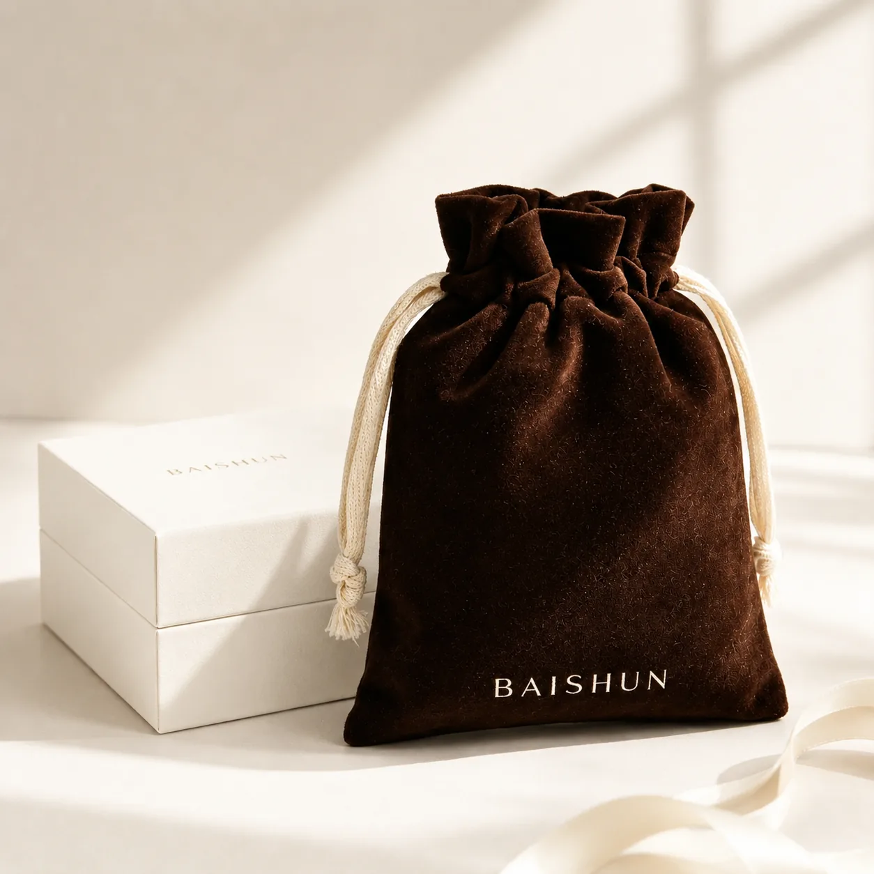
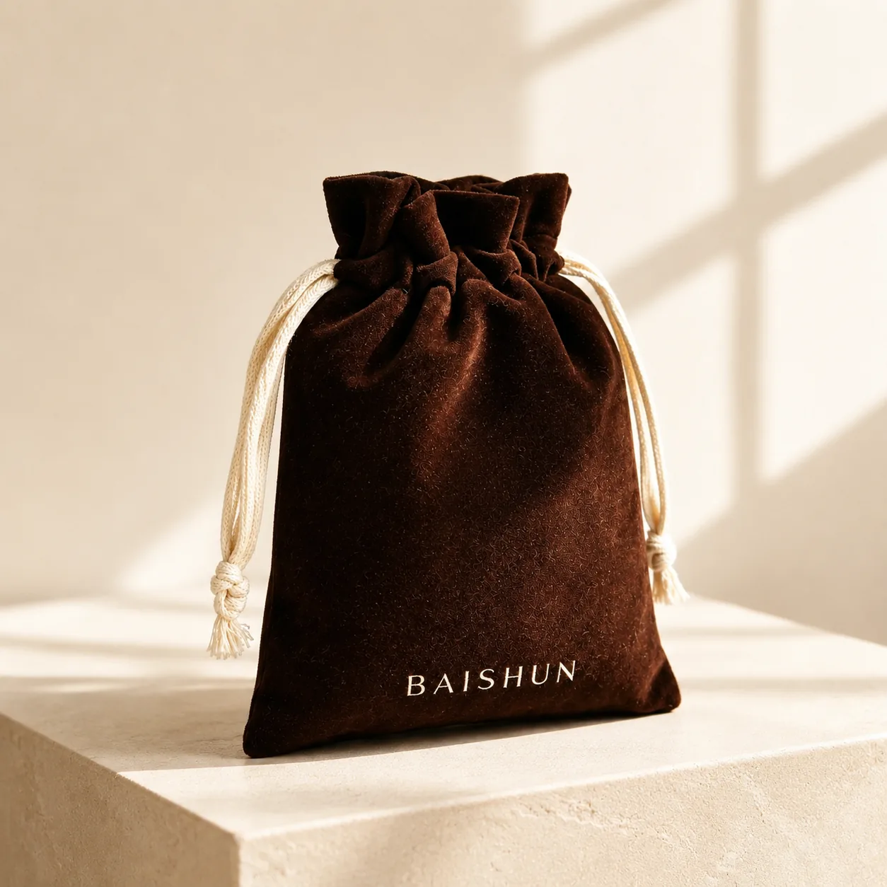
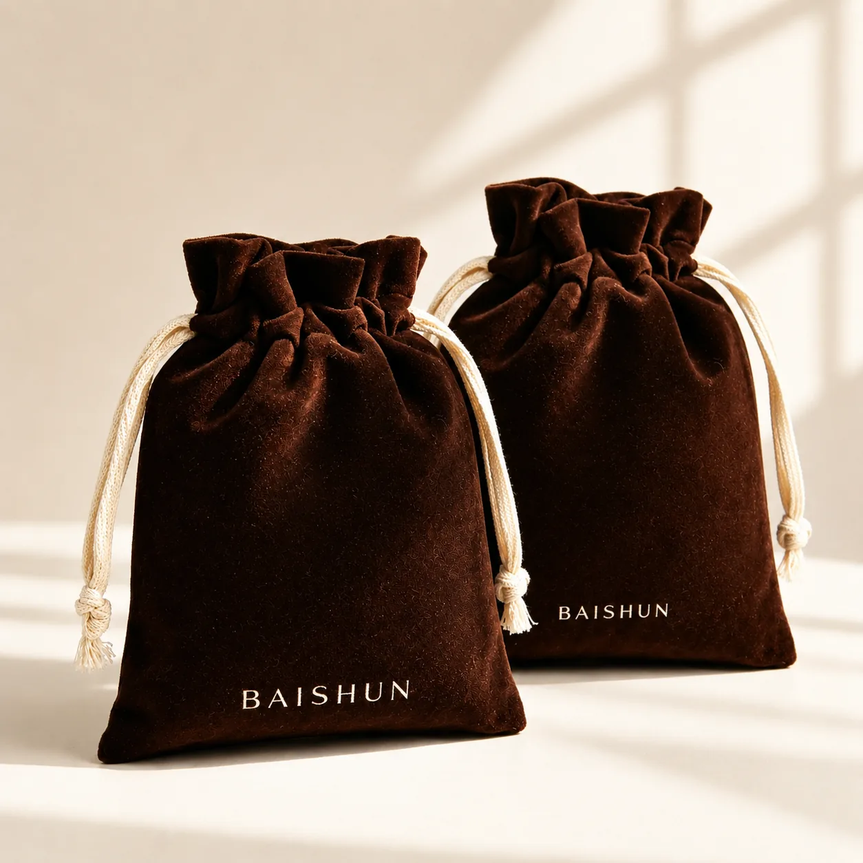
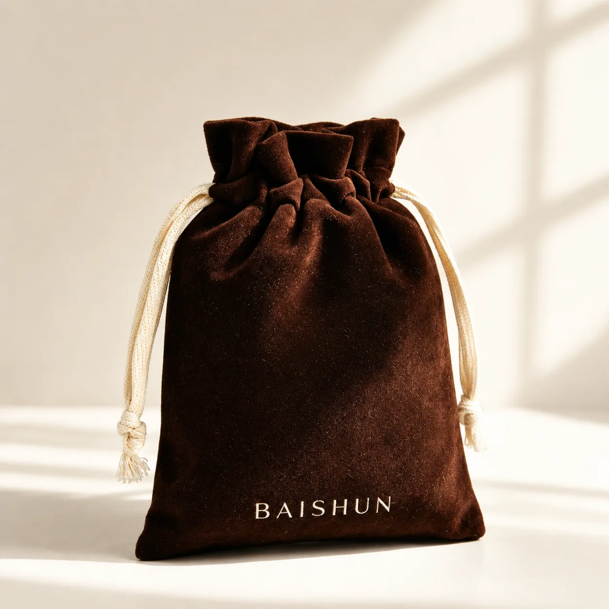
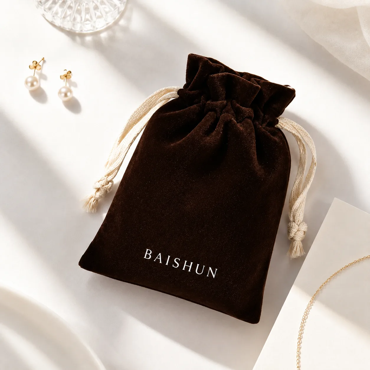
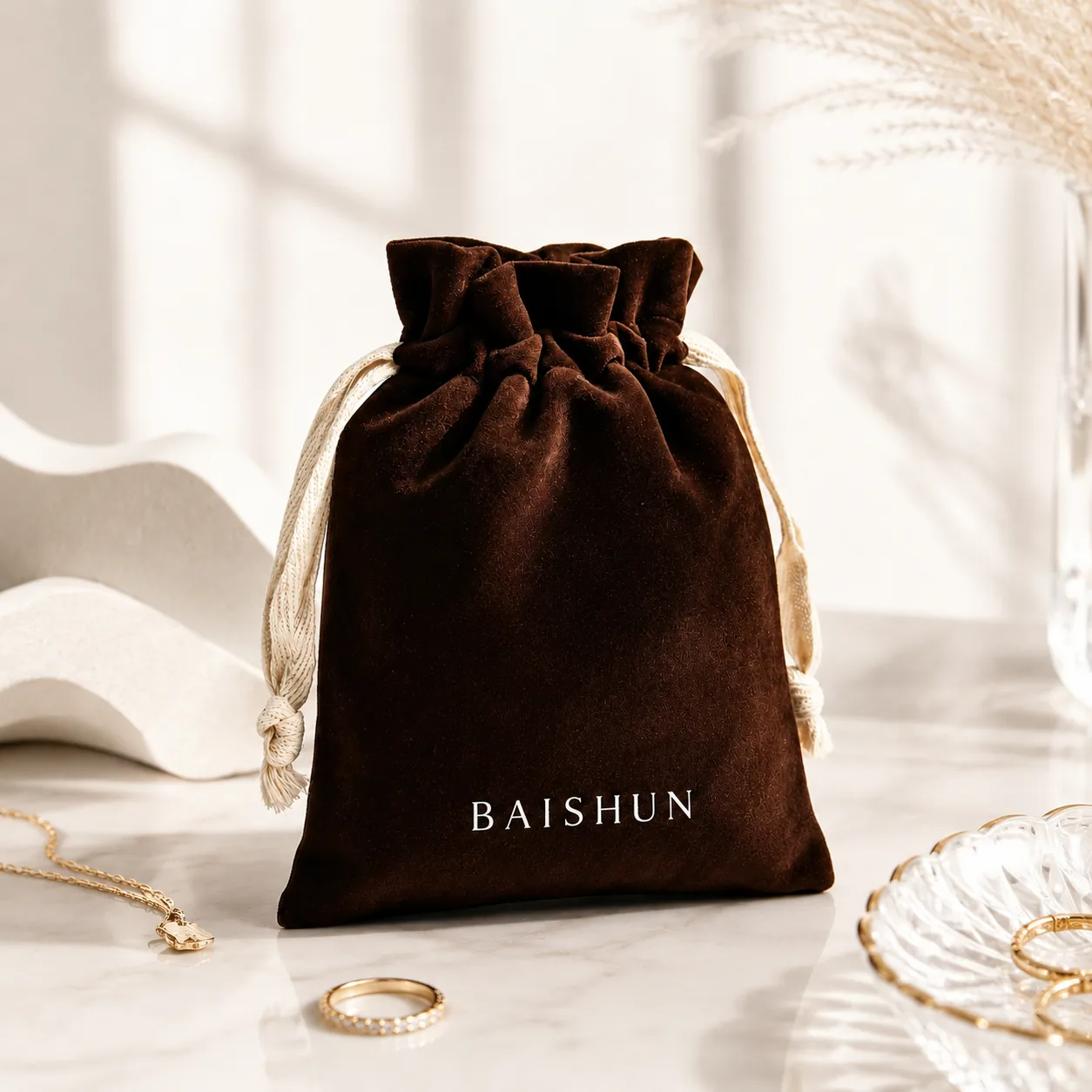
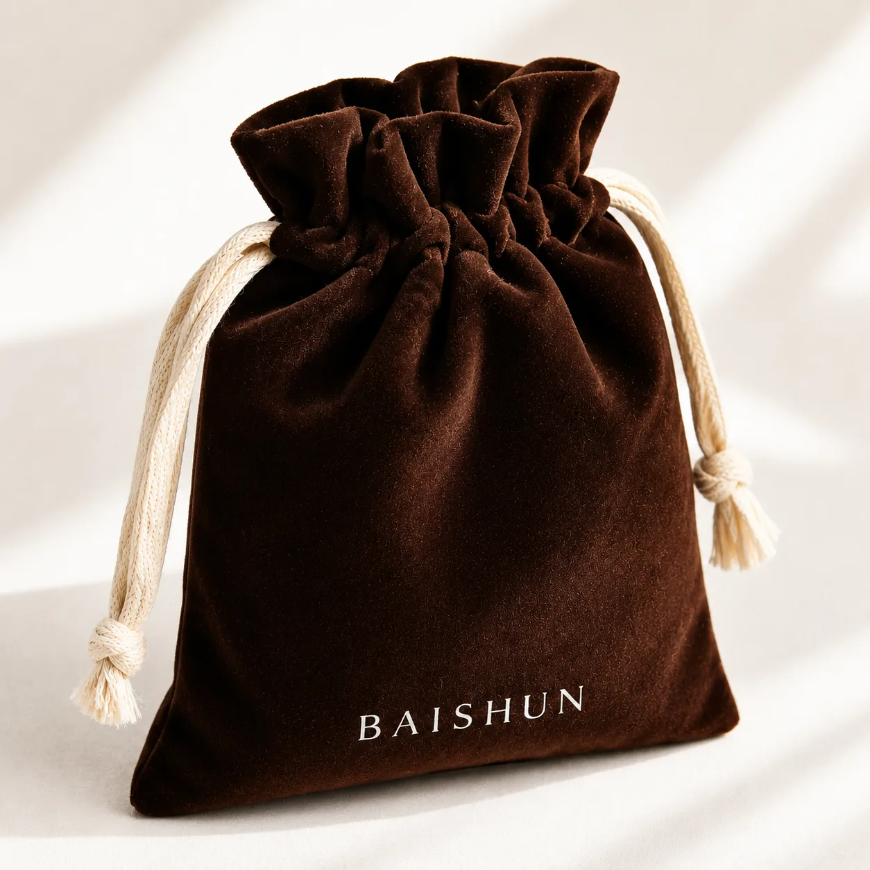
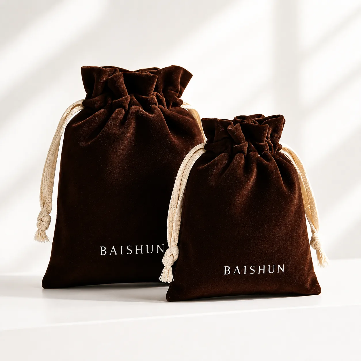
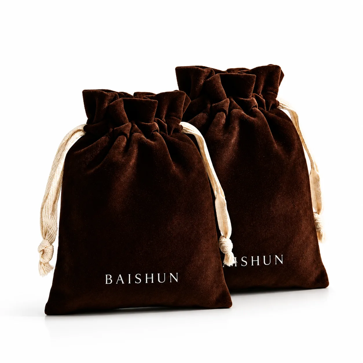
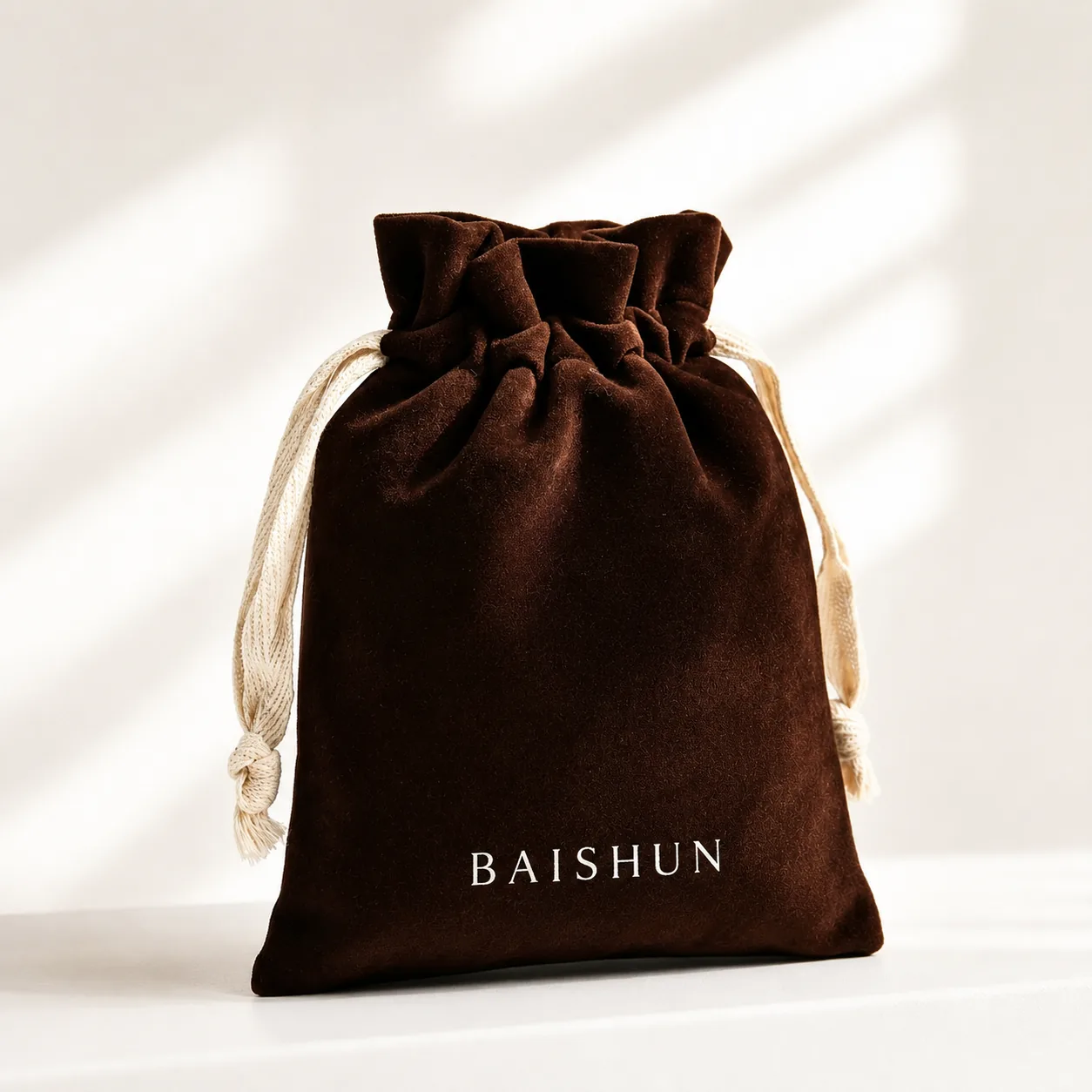
Professional Specs
- SKU
- VEL-067
- Category
- N/A
- Materials
- Premium Fabric Options
- MOQ
- 100 - 500 pcs
- Lead Time
- Sample: 3-5 days | Bulk: 12-18 days
Get a Custom Quote in 2 Hours
Free Digital Mockup & Shipping Estimate to Your Door.

✔ Low MOQ (100pcs)
✔ Global GRS Certified
✔ Door-to-Door Shipping
Questions About Dark Brown Velvet-Look Light-Cord Pouch
Can I customize Dark Brown Velvet-Look Light-Cord Pouch?
Yes. We are a direct factory. Any dimensions and logo can be manufactured.
What branding options?
Screen print, foil stamping, embroidery, and custom woven labels.
Sample lead time?
Physical samples take 3-5 working days.